# Flutter Docs

Documentation for all things Flutter @ Wednesday

<table data-view="cards"><thead><tr><th></th><th data-hidden data-card-target data-type="content-ref"></th><th data-hidden data-card-cover data-type="files"></th></tr></thead><tbody><tr><td>Chart It</td><td><a href="/pages/Ctok8XftyOdEULlmYA8o">/pages/Ctok8XftyOdEULlmYA8o</a></td><td><a href="/files/vqdOT6kfSWV28cwnVlNm">/files/vqdOT6kfSWV28cwnVlNm</a></td></tr><tr><td>Flutter Template</td><td><a href="https://github.com/wednesday-solutions/flutter_template">https://github.com/wednesday-solutions/flutter_template</a></td><td><a href="/files/vqdOT6kfSWV28cwnVlNm">/files/vqdOT6kfSWV28cwnVlNm</a></td></tr></tbody></table>


# Chart It

A customisable charts library with seamless animations for flutter

<div><figure><img src="/files/5e7aEE1JDzDBfDumdDUa" alt=""><figcaption></figcaption></figure> <figure><img src="/files/71ep2y4aF0aAqMB26fbW" alt=""><figcaption></figcaption></figure></div>

> You can find an example and source code on the [GitHub repo](https://github.com/wednesday-solutions/chart_it).

## Installation

Add the `chart_it` package to your project's `pubspec.yaml` file:

```yaml
dependencies:
  chart_it: ^0.2.2
```

Alternatively, you can also run the following command in your Flutter Project:

```shell
$ flutter pub add chart_it
```

## Supported Charts

All Charts in `` `chart_it` `` are categorized in two:

1. Cartesian Charts
   * Bar Chart
   * Multi-Bar Chart
2. Radial Charts
   * Pie Chart
   * Donut Chart

Pick a Chart Widget for the type of Chart you want to draw and provide the necessary data for them.

#### Quick Examples:

1. **Bar Charts**

   ```dart
   ...
   import 'package:chart_it/chart_it.dart';

   ...
   child: BarChart(
     maxYValue: 50,
     data: BarSeries(  
       barData: <BarGroup>[
         SimpleBar(  
           xValue: 10,  
           label: (value) => 'Group 1',  
           yValue: const BarData(yValue: 25),  
         ),  
         SimpleBar(  
           xValue: 6,  
           label: (value) => 'Group 1',  
           yValue: const BarData(yValue: 12),  
         ),  
         SimpleBar(  
           xValue: 19,  
           label: (value) => 'Group 1',  
           yValue: const BarData(yValue: 38),  
         ),
       ],  
     ),
   ),
   ```
2. **Donut Charts**

   ```dart
   ...
   import 'package:chart_it/chart_it.dart';

   ...
   child: PieChart(
     data: PieSeries(
       donutRadius: 50.0,  
       donutSpaceColor: Colors.white,  
       donutLabel: () => 'Market Shares',
       slices: <SliceData>[
         SliceData(  
           style: const SliceDataStyle(radius: 105.0, color: Colors.red),  
           label: (percent, value) => 'Tesla',  
           value: 34,  
         ),
         SliceData(  
           style: const SliceDataStyle(radius: 90.0, color: Colors.blueGrey),  
           label: (percent, value) => 'Space X',  
           value: 18,  
         ),
         SliceData(  
           style: const SliceDataStyle(radius: 90.0, color: Colors.green),  
           label: (percent, value) => 'Google',  
           value: 42,  
         ),  
         SliceData(  
           style: const SliceDataStyle(radius: 90.0, color: Colors.cyanAccent),  
           label: (percent, value) => 'Microsoft',  
           value: 57,  
         ),
       ],
     ),
   ),
   ```

## License

Flutter Charts is licensed under the BSD-3-Clause license. Check the [LICENSE](https://github.com/wednesday-solutions/flutter-charts/blob/dev/LICENSE) file for details.


# Guides


# Cartesian Charts

This section includes all the charts that you can plot on the cartesian co-ordinate system.

<table data-card-size="large" data-view="cards"><thead><tr><th></th><th data-hidden></th><th data-hidden></th><th data-hidden data-card-target data-type="content-ref"></th><th data-hidden data-card-cover data-type="files"></th></tr></thead><tbody><tr><td><strong>Bar Chart</strong></td><td>Bar Chart</td><td></td><td><a href="/pages/toMao9jrKxrz2gaEwTbz">/pages/toMao9jrKxrz2gaEwTbz</a></td><td><a href="/files/ucVFxSvrt1O08KaI5dhr">/files/ucVFxSvrt1O08KaI5dhr</a></td></tr><tr><td><em>More on the way!</em></td><td></td><td></td><td></td><td><a href="/files/vqdOT6kfSWV28cwnVlNm">/files/vqdOT6kfSWV28cwnVlNm</a></td></tr></tbody></table>


# Chart Structuring

Any `[CARTESIAN_TYPE]Chart` widget represents the data along the Cartesian Axes and plotted with the Cartesian Grid. We will learn about configuring the Chart Axes in the next chapter.

Every Cartesian Chart widget provides two key properties:

1. `chartStructureData`
2. `chartStylingData`

These properties control how your Grid and Axes layouts are configured as per provided data and stylised as required.

## ChartStructureData

First, let's understand the `chartStructureData` property, as it plays a vital role in the Grid Layout Construction. For this example, we will be using a `BarChart` in the code sample.

Let's take a look at the below example:

{% tabs %}
{% tab title="Code Sample" %}

<pre class="language-dart"><code class="lang-dart">...
BarChart(
  height: 400,
<strong>  chartStructureData: const CartesianChartStructureData(
</strong><strong>    xUnitValue: 1,
</strong><strong>    yUnitValue: 1,
</strong><strong>    maxXValue: 10,
</strong><strong>    maxYValue: 10,
</strong><strong>  ),
</strong>  data: BarSeries( // Data is mandatory for any chart
    barData: [
      SimpleBar(
        xValue: 1,
        yValue: const BarData(yValue: 2.3),
      ),
    ],
  ),
),
</code></pre>

{% endtab %}

{% tab title="Result" %}

<figure><img src="/files/H0hKhXPgn0QWcMCSDGzj" alt=""><figcaption></figcaption></figure>
{% endtab %}
{% endtabs %}

In the above example, we specified that our maximum values along X & Y axis are `10`. And we are to consider unit value as `1` for both. This creates a `10 x 10` Cartesian Grid in which we have plotted our bar value.

If we were to update the unit values to `2`, then we would get. `5 X 5` Grid. This how you can can use the `chartStructureData` property to effectively control the structuring of your grid dimensions, hence the name.

### Class Properties

<table><thead><tr><th width="135">Name</th><th width="293">Behaviour</th><th width="80">Type</th><th width="103">Required</th><th>Default Value</th></tr></thead><tbody><tr><td>xUnitValue</td><td>Constructs intervals along x-axis.</td><td><code>num</code></td><td><mark style="color:blue;">false</mark></td><td>1</td></tr><tr><td>yUnitValue</td><td>Constructs intervals along y-axis.</td><td><code>num</code></td><td><mark style="color:blue;">false</mark></td><td>10</td></tr><tr><td>maxXValue</td><td>The max value along +ve x-axis. Auto-calculated internally from series data if not specified.</td><td><code>num?</code></td><td><mark style="color:blue;">false</mark></td><td><code>null</code></td></tr><tr><td>maxYValue</td><td>The max value along +ve y-axis. Auto-calculated internally from series data if not specified.</td><td><code>num?</code></td><td><mark style="color:blue;">false</mark></td><td><code>null</code></td></tr></tbody></table>

Once the Chart Structure is defined, all that's left is styling for the Grid and Axes. We'll look at this in the next chapter.


# Grid Styling

Now that we have learned how to construct our Grid System. Now it's time to style it. For this we will use the `chartStylingData` property which contains the property `gridStyle`.

### CartesianGridStyle

{% tabs %}
{% tab title="Code Sample" %}

<pre class="language-dart"><code class="lang-dart">...
BarChart(
  height: 400,
  chartStructureData: const CartesianChartStructureData(
    xUnitValue: 2,
    yUnitValue: 2,
    maxXValue: 10,
    maxYValue: 10,
  ),
<strong>  chartStylingData: CartesianChartStylingData(
</strong><strong>    gridStyle: CartesianGridStyle(
</strong><strong>      show: true,
</strong><strong>      gridLineWidth: 3.0,
</strong><strong>      gridLineColor: Colors.white,
</strong><strong>    ),
</strong><strong>  ),
</strong>  data: BarSeries(
    barData: [
      SimpleBar(
        xValue: 1,
        yValue: const BarData(yValue: 2.3),
      ),
    ],
  ),
),
</code></pre>

{% endtab %}

{% tab title="Result" %}

<figure><img src="/files/kNYhZGh6FG9XqQBp8zMB" alt=""><figcaption></figcaption></figure>
{% endtab %}
{% endtabs %}

### Class Properties

| Name          | Type     | Required                               | Default Value    |
| ------------- | -------- | -------------------------------------- | ---------------- |
| show          | `bool`   | <mark style="color:blue;">false</mark> | `true`           |
| gridLineWidth | `double` | <mark style="color:blue;">false</mark> | `0.5`            |
| gridLineColor | `Color`  | <mark style="color:blue;">false</mark> | `Colors.black45` |


# Axes Styling

Let's take a look at our Axes system now. By default, any Cartesian Type Chart will draw the Cartesian X & Y Axes. To style our axes, we will use the `chartStylingData` property which provides us the `axisStyle` property.

## CartesianAxisStyle

{% tabs %}
{% tab title="Code Sample" %}

<pre class="language-dart"><code class="lang-dart">...
BarChart(
  height: 400,
  chartStructureData: const CartesianChartStructureData(
    xUnitValue: 1,
    yUnitValue: 2,
    maxYValue: 10,
  ),
  chartStylingData: CartesianChartStylingData(
<strong>    axisStyle: CartesianAxisStyle(
</strong><strong>      axisWidth: 3.0,
</strong><strong>      axisColor: Colors.white,
</strong><strong>    ),
</strong>    gridStyle: CartesianGridStyle(
      show: true,
      gridLineWidth: 1.0,
      gridLineColor: Colors.white,
    ),
  ),
  data: BarSeries(
    barData: [
      SimpleBar(
        xValue: 1,
        yValue: const BarData(yValue: 2.3),
      ),
      SimpleBar(
        xValue: 2,
        yValue: const BarData(yValue: 7.2),
      ),
      SimpleBar(
        xValue: 3,
        yValue: const BarData(yValue: 4.8),
      ),
    ],
  ),
),
</code></pre>

{% endtab %}

{% tab title="Result" %}

<figure><img src="/files/mHG7rO0dALppDUSw9qTg" alt=""><figcaption></figcaption></figure>
{% endtab %}
{% endtabs %}

You may be intrigued before with the lack of `minXValue` and `minYValue` properties in ChartStructureData property before. This is because the chart auto shifts the origin points to present Negative Axes if Negative values are found.

{% tabs %}
{% tab title="Code Sample" %}

<pre class="language-dart"><code class="lang-dart">...
BarChart(
  height: 400,
  chartStructureData: const CartesianChartStructureData(
    xUnitValue: 2,
    yUnitValue: 2,
    maxYValue: 10,
  ),
  chartStylingData: CartesianChartStylingData(
    axisStyle: CartesianAxisStyle(
      axisWidth: 3.0,
      axisColor: Colors.white,
    ),
    gridStyle: CartesianGridStyle(
      show: true,
      gridLineWidth: 1.0,
      gridLineColor: Colors.white,
    ),
  ),
  data: BarSeries(
    barData: [
      SimpleBar(
        xValue: 1,
        yValue: const BarData(yValue: 2.3),
      ),
      SimpleBar(
        xValue: 2,
        yValue: const BarData(yValue: 7.2),
      ),
      SimpleBar(
        xValue: 3,
<strong>        yValue: const BarData(yValue: -4.8), // Negative Data
</strong>      ),
    ],
  ),
),
</code></pre>

{% endtab %}

{% tab title="Result" %}

<figure><img src="/files/xLaGCSGmi1hyt9xAMI36" alt=""><figcaption></figcaption></figure>
{% endtab %}
{% endtabs %}

We can also add interval ticks along the axes. By default, ticks are not visible, and can be enabled individually with the default constructor or with the `showTicks` property of `AxisTickConfig.forAllAxis` constructor.

{% tabs %}
{% tab title="For Individual Axes" %}

<pre class="language-dart"><code class="lang-dart">...
BarChart(
  ...
  chartStylingData: CartesianChartStylingData(
    axisStyle: CartesianAxisStyle(
      axisWidth: 3.0,
      axisColor: Colors.white,
<strong>      tickConfig: AxisTickConfig(
</strong><strong>        showTicks: true,
</strong><strong>        tickLength: 15.0,
</strong><strong>        tickWidth: 1.0,
</strong><strong>        tickColor: Colors.white,
</strong><strong>        showTickOnLeftAxis: true,
</strong><strong>        showTickOnBottomAxis: true,
</strong>      ),
    ),
    ...
  ),
  ...
),
</code></pre>

{% endtab %}

{% tab title="For All Axes" %}

<pre class="language-dart"><code class="lang-dart">...
BarChart(
  ...
  chartStylingData: CartesianChartStylingData(
    axisStyle: CartesianAxisStyle(
      axisWidth: 3.0,
      axisColor: Colors.white,
<strong>      tickConfig: AxisTickConfig.forAllAxis(
</strong><strong>        showTicks: true,
</strong><strong>        tickLength: 15.0,
</strong><strong>        tickWidth: 1.0,
</strong><strong>        tickColor: Colors.white,
</strong><strong>      ),
</strong>    ),
    ...
  ),
  ...
),
</code></pre>

{% endtab %}

{% tab title="Result" %}

<figure><img src="/files/46bSicBT8uftO64flpHo" alt=""><figcaption></figcaption></figure>
{% endtab %}
{% endtabs %}

### CartesianAxisStyle Class Properties

| Name       | Type             | Required                               | Default Value    |
| ---------- | ---------------- | -------------------------------------- | ---------------- |
| axisWidth  | `double`         | <mark style="color:blue;">false</mark> | `2.0`            |
| axisColor  | `Color`          | <mark style="color:blue;">false</mark> | `Colors.black45` |
| tickConfig | `AxisTickConfig` | <mark style="color:blue;">false</mark> | Class Defaults   |

### AxisTickConfig Class Properties

{% tabs %}
{% tab title="Common Properties" %}

| Name         | Type     | Required                               | Default Value    |
| ------------ | -------- | -------------------------------------- | ---------------- |
| tickLength   | `double` | <mark style="color:blue;">false</mark> | 15`.0`           |
| tickWidth    | `double` | <mark style="color:blue;">false</mark> | `1.0`            |
| tickColor    | `Color`  | <mark style="color:blue;">false</mark> | `Colors.black45` |
| {% endtab %} |          |                                        |                  |

{% tab title="Primary Constructor" %}

<table><thead><tr><th width="237">Name</th><th width="152">Type</th><th width="151">Required</th><th>Default Value</th></tr></thead><tbody><tr><td>showTickOnLeftAxis</td><td><code>bool</code></td><td><mark style="color:blue;">false</mark></td><td><code>false</code></td></tr><tr><td>showTickOnTopAxis</td><td><code>bool</code></td><td><mark style="color:blue;">false</mark></td><td><code>false</code></td></tr><tr><td>showTickOnBottomAxis</td><td><code>bool</code></td><td><mark style="color:blue;">false</mark></td><td><code>false</code></td></tr><tr><td>showTickOnRightAxis</td><td><code>bool</code></td><td><mark style="color:blue;">false</mark></td><td><code>false</code></td></tr></tbody></table>
{% endtab %}

{% tab title="forAllAxis" %}

| Name          | Type   | Required                               | Default Value |
| ------------- | ------ | -------------------------------------- | ------------- |
| showTicks     | `bool` | <mark style="color:blue;">false</mark> | `false`       |
| {% endtab %}  |        |                                        |               |
| {% endtabs %} |        |                                        |               |


# Axis Labels

The only missing element of our basic chart structure are Axis Labels. These are labels you would like to display on each interval tick along the axis.

To display interval labels along the axes, we will use the `axisLabels` property on any Cartesian Chart.

## AxisLabels

The property `axisLabels` requires a `AxisLabelConfig` for each individual axis. If the config is not provided, then interval labels won't be rendered for those axes.

{% tabs %}
{% tab title="Code Sample" %}

<pre class="language-dart"><code class="lang-dart">...
BarChart(
  height: 400,
  chartStructureData: const CartesianChartStructureData(
    xUnitValue: 1,
    yUnitValue: 2,
    maxYValue: 10,
  ),
  chartStylingData: CartesianChartStylingData(
    axisStyle: CartesianAxisStyle(
      axisWidth: 3.0,
      axisColor: Colors.white,
      tickConfig: AxisTickConfig.forAllAxis(
        showTicks: true,
        tickLength: 10.0,
        tickColor: Colors.white,
      ),
    ),
    gridStyle: CartesianGridStyle(
      show: true,
      gridLineWidth: 1.0,
      gridLineColor: Colors.white,
    ),
  ),
<strong>  axisLabels: AxisLabels(
</strong><strong>    left: AxisLabelConfig(
</strong><strong>      builder: (index, value) => Padding(
</strong><strong>        padding: const EdgeInsets.only(right: 8.0),
</strong><strong>        child: Text(
</strong><strong>          '$index',
</strong><strong>          style: const TextStyle(color: Colors.white),
</strong><strong>        ),
</strong><strong>      ),
</strong><strong>    ),
</strong><strong>    bottom: AxisLabelConfig(
</strong><strong>      builder: (index, value) => Padding(
</strong><strong>        padding: const EdgeInsets.only(top: 8.0),
</strong><strong>        child: Text(
</strong><strong>          '$index',
</strong><strong>          style: const TextStyle(color: Colors.white),
</strong><strong>        ),
</strong><strong>      ),
</strong><strong>    ),
</strong><strong>  ),
</strong>  data: BarSeries(
    barData: [
      SimpleBar(
        xValue: 1,
        yValue: const BarData(yValue: 2.3),
      ),
      SimpleBar(
        xValue: 2,
        yValue: const BarData(yValue: 7.2),
      ),
      SimpleBar(
        xValue: 3,
        yValue: const BarData(yValue: -4.8),
      ),
    ],
  ),
),
</code></pre>

{% endtab %}

{% tab title="Result" %}

<figure><img src="/files/rBvPEwZm5BDt8AbL7dQ4" alt=""><figcaption></figcaption></figure>
{% endtab %}
{% endtabs %}

Let's dive deeper into the `AxisLabelConfig` that's been provided to left and bottom edges.

## AxisLabelConfig

Each config must implement the mandatory `builder` method. This method provides the `index` of that iteration, and the `value` of the interval that has been processed with the Unit Values. Finally, it must return a widget that will be displayed as the label.&#x20;

Because the label consumes a widget, you have the complete freedom to provide even images or icons if you choose.

Additionally, there are two more properties that can help you position your labels better.

If you wish to have your labels positioned in the center of the unit interval, you can set the value of `centerLabels` property to true.

{% tabs %}
{% tab title="Code Sample" %}

<pre class="language-dart"><code class="lang-dart">...
BarChart(
  height: 400,
  chartStructureData: const CartesianChartStructureData(
    xUnitValue: 1,
    yUnitValue: 3,
  ),
  chartStylingData: CartesianChartStylingData(
    axisStyle: CartesianAxisStyle(
      axisWidth: 3.0,
      axisColor: Colors.white,
      tickConfig: AxisTickConfig.forAllAxis(
        showTicks: true,
        tickLength: 10.0,
        tickColor: Colors.white,
      ),
    ),
    gridStyle: CartesianGridStyle(
      show: true,
      gridLineWidth: 1.0,
      gridLineColor: Colors.white,
    ),
  ),
  axisLabels: AxisLabels(
    left: AxisLabelConfig(
<strong>      centerLabels: true,
</strong>      builder: (index, value) => Padding(
        padding: const EdgeInsets.only(right: 8.0),
        child: Text(
          '$index',
          style: const TextStyle(color: Colors.white),
        ),
      ),
    ),
    bottom: AxisLabelConfig(
<strong>      centerLabels: true,
</strong>      builder: (index, value) => Padding(
        padding: const EdgeInsets.only(top: 8.0),
        child: Text(
          '$index',
          style: const TextStyle(color: Colors.white),
        ),
      ),
    ),
  ),
  data: BarSeries(
    barData: [
      SimpleBar(
        xValue: 1,
        yValue: const BarData(yValue: 2.3),
      ),
      SimpleBar(
        xValue: 2,
        yValue: const BarData(yValue: 7.2),
      ),
      SimpleBar(
        xValue: 3,
        yValue: const BarData(yValue: 4.8),
      ),
    ],
  ),
),
</code></pre>

{% endtab %}

{% tab title="Result" %}

<figure><img src="/files/lFgpwbikc0wZL0wAl9wJ" alt=""><figcaption></figcaption></figure>
{% endtab %}
{% endtabs %}

And you can constrain the labels at the edges of each axis to fit within the axis range.

{% tabs %}
{% tab title="Code Sample" %}

```dart
BarChart(
  height: 400,
  chartStructureData: const CartesianChartStructureData(
    xUnitValue: 1,
    yUnitValue: 3,
  ),
  chartStylingData: CartesianChartStylingData(
    axisStyle: CartesianAxisStyle(
      axisWidth: 3.0,
      axisColor: Colors.white,
      tickConfig: AxisTickConfig.forAllAxis(
        showTicks: true,
        tickLength: 10.0,
        tickColor: Colors.white,
      ),
    ),
    gridStyle: CartesianGridStyle(
      show: true,
      gridLineWidth: 1.0,
      gridLineColor: Colors.white,
    ),
  ),
  axisLabels: AxisLabels(
    left: AxisLabelConfig(
      centerLabels: true,
      builder: (index, value) => Padding(
        padding: const EdgeInsets.only(right: 8.0),
        child: Text(
          '$index',
          style: const TextStyle(color: Colors.white),
        ),
      ),
    ),
    bottom: AxisLabelConfig(
      centerLabels: true,
      builder: (index, value) => Padding(
        padding: const EdgeInsets.only(top: 8.0),
        child: Text(
          '$index',
          style: const TextStyle(color: Colors.white),
        ),
      ),
    ),
  ),
  data: BarSeries(
    barData: [
      SimpleBar(
        xValue: 1,
        yValue: const BarData(yValue: 2.3),
      ),
      SimpleBar(
        xValue: 2,
        yValue: const BarData(yValue: 7.2),
      ),
      SimpleBar(
        xValue: 3,
        yValue: const BarData(yValue: 4.8),
      ),
    ],
  ),
),
```

{% endtab %}

{% tab title="Result" %}

<figure><img src="/files/nsqieUjNA4SzTbW14zHA" alt=""><figcaption></figcaption></figure>
{% endtab %}
{% endtabs %}

### Class Properties

<table><thead><tr><th width="217">Name</th><th width="242">Type</th><th width="112">Required</th><th>Default Value</th></tr></thead><tbody><tr><td>builder</td><td><code>Widget Function(int, double)</code></td><td><mark style="color:red;">true</mark></td><td>--</td></tr><tr><td>centerLabels</td><td><code>bool</code></td><td><mark style="color:blue;">false</mark></td><td><code>false</code></td></tr><tr><td>constraintEdgeLabels</td><td><code>bool</code></td><td><mark style="color:blue;">false</mark></td><td><code>false</code></td></tr></tbody></table>

This concludes our section to structure and customize the Cartesian Grid and Axes elements.


# Charts


# Bar Chart

In depth guide to the Bar Chart Widget.

A Bar Chart is the most common visual representation of numeric data as Vertical or Horizontal Bars.

To draw a Bar Chart, we will use the `BarChart` widget. \
Let's use the widget to draw a simple bar chart with only one Bar.

{% tabs %}
{% tab title="Code Sample" %}

```dart
...
import 'package:chart_it/chart_it.dart';

class TestBarCharts extends StatefulWidget {
  const TestBarCharts({Key? key}) : super(key: key);

  @override
  State<TestBarCharts> createState() => _TestBarChartsState();
}

class _TestBarChartsState extends State<TestBarCharts> {
  @override
  Widget build(BuildContext context) {
    return BarChart(
      data: BarSeries(
        barData: <BarGroup>[
          SimpleBar(
            xValue: 1,
            yValue: BarData(yValue: 27),
          ),
        ],
      ),
    );
  }
}
```

{% endtab %}

{% tab title="Result" %}

<figure><img src="/files/L6TDr53igAsWM79K0JG2" alt=""><figcaption></figcaption></figure>
{% endtab %}
{% endtabs %}

Before moving forward, let's understand the above example code.

The widget `BarChart` requires a **mandatory** field `data` of type `BarSeries`. This is a series class that ensures that any data provided to this series should be represented as a BarChart.

The `BarSeries` requires `barData` which is a List of `BarGroup`. You can see that we have provided a class `SimpleBar` which extends a BarGroup. BarGroups define how your data will be represented as Bars on the chart. We will go into further details for `BarGroup` later.

Finally, our `SimpleBar` takes a `yValue` of class `BarData` which also requires a `yValue` which is a numeric value, representing the data value for this `SimpleBar`. \
You may have some questions about the structuring complexity of these data classes for the widget, just to draw a simple bar. But it will be clear behind this approach in later sections.


# BarSeries

The `BarSeries` is the top level data class wrapper. It holds the `data` for plotting the bars, styling for all the bars at a data series level and the interaction config to interact with the Bars.

This class ensures that any data provided to this series will be represented only and only as a BarChart.

### Class Properties

<table><thead><tr><th>Name</th><th width="260">Type</th><th width="118">Required</th><th>Default Value</th></tr></thead><tbody><tr><td>barData</td><td><code>List&#x3C;BarGroup></code></td><td><mark style="color:red;">true</mark></td><td>-</td></tr><tr><td>seriesStyle</td><td><code>BarDataStyle?</code></td><td><mark style="color:blue;">false</mark></td><td><code>null</code></td></tr><tr><td>interactionEvents</td><td><code>BarInteractionEvents</code></td><td><mark style="color:blue;">false</mark></td><td>Default Constructor</td></tr></tbody></table>


# Bar Groups

Dive into the different types of BarGroups that a BarSeries can display

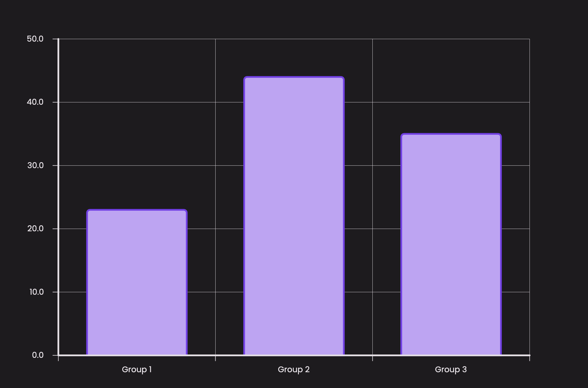
Jumping back to our previous example, we provided a `SimpleBar` with a xValue and a yValue `BarData` to our `BarSeries` class.

BarGroups are the building blocks of a BarChart. They define how your data will represented as a Bar Rod, and also provides styling options should you choose to customize your individual bars.

Right now, there are two types of `BarGroup`s you can use:

1. **SimpleBar** - draws a single bar of height representing the yValue.
2. **MultiBar** - draws a group of multiple bars with each bar representing their own yValues.


# SimpleBar

The `SimpleBar` is a type of `BarGroup` which accepts only one `yValue` and tells the Widget to draw a Single Bar of height representing the `yValue`.

{% tabs %}
{% tab title="Code Sample" %}

```dart
...
import 'package:chart_it/chart_it.dart';

class TestBarCharts extends StatefulWidget {
  const TestBarCharts({Key? key}) : super(key: key);

  @override
  State<TestBarCharts> createState() => _TestBarChartsState();
}

class _TestBarChartsState extends State<TestBarCharts> {
  @override
  Widget build(BuildContext context) {
    return BarChart(
      ... // any chart configs
      data: BarSeries(
        barData: <BarGroup>[
          SimpleBar(
            xValue: 1,
            yValue: BarData(yValue: 23),
          ),
          SimpleBar(
            xValue: 2,
            yValue: BarData(yValue: 44),
          ),
          SimpleBar(
            xValue: 3,
            yValue: BarData(yValue: 35),
          ),
        ],
      ),
    );
  }
}
```

{% endtab %}

{% tab title="Result" %}

<figure><img src="/files/mOEIDJLKDK0U7JeKoBMx" alt=""><figcaption></figcaption></figure>
{% endtab %}
{% endtabs %}

### Class Properties

<table><thead><tr><th width="142">Name</th><th width="272">Type</th><th width="200">Required</th><th>Default Value</th></tr></thead><tbody><tr><td>xValue</td><td><code>num</code></td><td><mark style="color:red;">true</mark></td><td>-</td></tr><tr><td>yValue</td><td><code>num</code></td><td><mark style="color:red;">true</mark></td><td>-</td></tr><tr><td>padding</td><td><code>double</code></td><td><mark style="color:blue;">false</mark></td><td><code>10.0</code></td></tr><tr><td>style</td><td><code>BarDataStyle?</code></td><td><mark style="color:blue;">false</mark></td><td><code>null</code></td></tr></tbody></table>


# MultiBar

The `MultiBar` is a type of `BarGroup` which can accept multiple `yValue`s and tells the Widget to draw a Group of Bars, each of height representing their own `yValue`.

{% tabs %}
{% tab title="Code Sample" %}

```dart
...
import 'package:chart_it/chart_it.dart';

class TestBarCharts extends StatefulWidget {
  const TestBarCharts({Key? key}) : super(key: key);

  @override
  State<TestBarCharts> createState() => _TestBarChartsState();
}

class _TestBarChartsState extends State<TestBarCharts> {
  @override
  Widget build(BuildContext context) {
    return BarChart(
      ... // any chart configs
      data: BarSeries(
        barData: <BarGroup>[
          MultiBar(
            xValue: 1,
            yValues: [
              BarData(yValue: 18),
              BarData(yValue: 27),
            ],
          ),
          MultiBar(
            xValue: 2,
            yValues: [
              BarData(yValue: 46),
              BarData(yValue: 24),
            ],
          ),
          MultiBar(
            xValue: 3,
            yValues: [
              BarData(yValue: 29),
              BarData(yValue: 39),
            ],
          ),
        ],
      ),
    );
  }
}
```

{% endtab %}

{% tab title="Result" %}

<figure><img src="/files/RDEnw8ks8KzDm76qwRV6" alt=""><figcaption></figcaption></figure>
{% endtab %}
{% endtabs %}

Above example will display three bar groups, each consisting of two bars!

By default, `MultiBar`s will arrange all the bars in a `series` manner. You can also provide some padding spacing between each bar in the group.

{% tabs %}
{% tab title="Code Sample" %}

<pre class="language-dart"><code class="lang-dart">...
import 'package:chart_it/chart_it.dart';

class TestBarCharts extends StatefulWidget {
  const TestBarCharts({Key? key}) : super(key: key);

  @override
  State&#x3C;TestBarCharts> createState() => _TestBarChartsState();
}

class _TestBarChartsState extends State&#x3C;TestBarCharts> {
  @override
  Widget build(BuildContext context) {
    return BarChart(
      ... // any chart configs
      data: BarSeries(
        barData: &#x3C;BarGroup>[
          MultiBar(
<strong>            arrangement: BarGroupArrangement.series,
</strong><strong>            spacing: 10.0,
</strong>            xValue: 1,
            yValues: [
              BarData(yValue: 18),
              BarData(yValue: 27),
            ],
          ),
          MultiBar(
<strong>            arrangement: BarGroupArrangement.series,
</strong><strong>            spacing: 50.0,
</strong>            xValue: 2,
            yValues: [
              BarData(yValue: 46),
              BarData(yValue: 24),
            ],
          ),
          MultiBar(
<strong>            arrangement: BarGroupArrangement.series,
</strong><strong>            spacing: 10.0,
</strong>            xValue: 3,
            yValues: [
              BarData(yValue: 29),
              BarData(yValue: 39),
            ],
          ),
        ],
      ),
    );
  }
}
</code></pre>

{% endtab %}

{% tab title="Result" %}

<figure><img src="/files/gpoyhXz7I0XdSjT9zSQA" alt=""><figcaption></figcaption></figure>
{% endtab %}
{% endtabs %}

To arrange the Bars in a vertical stack, change the enum value for the `arrangement` field to `BarGroupArrangement.stack`.

{% tabs %}
{% tab title="Code Sample" %}

<pre class="language-dart"><code class="lang-dart">...
MultiBar(
<strong>  arrangement: BarGroupArrangement.stack,
</strong>  xValue: 1,
  yValues: [
    BarData(yValue: 18),
    BarData(yValue: 27),
  ],
),
...
</code></pre>

{% endtab %}

{% tab title="Result" %}

<figure><img src="/files/TYzTjS3MONB1KZdypdA3" alt=""><figcaption></figcaption></figure>
{% endtab %}
{% endtabs %}

{% hint style="info" %}
When Group Arrangement is `stack`, any `spacing` value provided will be ignored.
{% endhint %}

### Class Properties

<table><thead><tr><th width="160">Name</th><th width="247">Type</th><th width="117">Required</th><th>Default Value</th></tr></thead><tbody><tr><td>xValue</td><td><code>num</code></td><td><mark style="color:red;">true</mark></td><td>-</td></tr><tr><td>yValues</td><td><code>List&#x3C;BarData></code></td><td><mark style="color:red;">true</mark></td><td>-</td></tr><tr><td>style</td><td><code>BarDataStyle?</code></td><td><mark style="color:blue;">false</mark></td><td><code>null</code></td></tr><tr><td>arrangement</td><td><code>BarGroupArrangement</code></td><td><mark style="color:blue;">false</mark></td><td><code>BarGroupArrangement.series</code></td></tr><tr><td>spacing</td><td><code>double</code></td><td><mark style="color:blue;">false</mark></td><td><code>10.0</code></td></tr></tbody></table>


# Styling

All styling in the `BarChart` and other chart widgets are **Hierarchical** from Top to Bottom. This means that the *Bottom/Child* level styling will **override** the *Top/Parent* level styling.

The class `BarDataStyle` provides the styling options for the `BarChart`.

Let's take an example to see how it works.

{% tabs %}
{% tab title="Code Sample" %}

```dart
...
import 'package:chart_it/chart_it.dart';

class TestBarCharts extends StatefulWidget {
  const TestBarCharts({Key? key}) : super(key: key);

  @override
  State<TestBarCharts> createState() => _TestBarChartsState();
}

class _TestBarChartsState extends State<TestBarCharts> {
  @override
  Widget build(BuildContext context) {
    return BarChart(
      ... // any chart configs
      data: BarSeries(
        barData: <BarGroup>[
          SimpleBar(
            xValue: 1,
            yValue: BarData(yValue: 37),
          ),
          MultiBar(
            spacing: 10.0,
            xValue: 2,
            yValues: [
              BarData(yValue: 18),
              BarData(yValue: 27),
            ],
          ),
          SimpleBar(
            xValue: 3,
            yValue: BarData(yValue: 30),
          ),
          MultiBar(
            spacing: 10.0,
            xValue: 4,
            yValues: [
              BarData(yValue: 46),
              BarData(yValue: 24),
            ],
          ),
        ],
      ),
    );
  }
}
```

{% endtab %}

{% tab title="Result" %}

<figure><img src="/files/bqKoDrEmbLuk4uGQDJUz" alt=""><figcaption></figcaption></figure>
{% endtab %}
{% endtabs %}

Above example will draw a collection of Single and MultiGroup Bars. Now let's add styling to our bars in this example.

### Series Styling

To provide uniform styling for **All the Bars** in the `BarChart`, we provide the styling at *Series* Level to the `seriesStyle` property of the `BarSeries` class.

{% tabs %}
{% tab title="Code Sample" %}

<pre class="language-dart"><code class="lang-dart">...
import 'package:chart_it/chart_it.dart';

class TestBarCharts extends StatefulWidget {
  const TestBarCharts({Key? key}) : super(key: key);

  @override
  State&#x3C;TestBarCharts> createState() => _TestBarChartsState();
}

class _TestBarChartsState extends State&#x3C;TestBarCharts> {
  @override
  Widget build(BuildContext context) {
    return BarChart(
      ... // any chart configs
      data: BarSeries(
<strong>        seriesStyle: BarDataStyle(
</strong><strong>          barColor: Colors.cyan,
</strong><strong>          strokeWidth: 3.0,
</strong><strong>          strokeColor: Color(0xFF1A535C),
</strong><strong>          cornerRadius: BorderRadius.only(
</strong><strong>            topLeft: Radius.circular(10.0),
</strong><strong>            topRight: Radius.circular(10.0),
</strong><strong>          ),
</strong><strong>        ),
</strong>        barData: &#x3C;BarGroup>[
          SimpleBar(
            xValue: 1,
            yValue: BarData(yValue: 37),
          ),
          MultiBar(
            spacing: 10.0,
            xValue: 2,
            yValues: [
              BarData(yValue: 18),
              BarData(yValue: 27),
            ],
          ),
          SimpleBar(
            xValue: 3,
            yValue: BarData(yValue: 30),
          ),
          MultiBar(
            spacing: 10.0,
            xValue: 4,
            yValues: [
              BarData(yValue: 46),
              BarData(yValue: 24),
            ],
          ),
        ],
      ),
    );
  }
}
</code></pre>

{% endtab %}

{% tab title="Result" %}

<figure><img src="/files/LgCW333ngoFXyKN4Isz0" alt=""><figcaption></figcaption></figure>
{% endtab %}
{% endtabs %}

### Group Styling

If you wish to provide a specific uniform styling for all the bars **in a group**, you can provide styling at *Group* Level to the `groupStyle` property for any `BarGroup`.

{% tabs %}
{% tab title="Code Sample" %}

<pre class="language-dart"><code class="lang-dart">...
import 'package:chart_it/chart_it.dart';

class TestBarCharts extends StatefulWidget {
  const TestBarCharts({Key? key}) : super(key: key);

  @override
  State&#x3C;TestBarCharts> createState() => _TestBarChartsState();
}

class _TestBarChartsState extends State&#x3C;TestBarCharts> {
  @override
  Widget build(BuildContext context) {
    return BarChart(
      ... // any chart configs
      data: BarSeries(
        seriesStyle: BarDataStyle(
          barColor: Colors.cyan,
          strokeWidth: 3.0,
          strokeColor: Color(0xFF1A535C),
          cornerRadius: BorderRadius.only(
            topLeft: Radius.circular(10.0),
            topRight: Radius.circular(10.0),
          ),
        ),
        barData: &#x3C;BarGroup>[
          SimpleBar(
            xValue: 1,
            yValue: BarData(yValue: 37),
          ),
          MultiBar(
<strong>            groupStyle: BarDataStyle(
</strong><strong>              barColor: Color(0xFFD0FFD6),
</strong><strong>              strokeWidth: 3.0,
</strong><strong>              strokeColor: Colors.green,
</strong><strong>              cornerRadius: BorderRadius.only(
</strong><strong>                topLeft: Radius.circular(5.0),
</strong><strong>                topRight: Radius.circular(5.0),
</strong><strong>              ),
</strong><strong>            ),
</strong>            spacing: 10.0,
            xValue: 2,
            yValues: [
              BarData(yValue: 18),
              BarData(yValue: 27),
            ],
          ),
          SimpleBar(
            xValue: 3,
            yValue: BarData(yValue: 30),
          ),
          MultiBar(
            spacing: 10.0,
            xValue: 4,
            yValues: [
              BarData(yValue: 46),
              BarData(yValue: 24),
            ],
          ),
        ],
      ),
    );
  }
}
</code></pre>

{% endtab %}

{% tab title="Result" %}

<figure><img src="/files/qNQ7FfuCcwqrtfT0NPx9" alt=""><figcaption></figcaption></figure>
{% endtab %}
{% endtabs %}

The `groupStyle` has overridden the styling at the `seriesStyle` for Group 2 Multi Bars. `groupStyle` property is available for every subclass that extends a BarGroup.&#x20;

Theoretically, you can also provide `groupStyle` to a `SimpleBar`, even tough you only have one bar.

### Bar Styling

Besides `seriesStyle` and `groupStyle`, you can can also customize **each individual bars** with the property **barStyle** for every `BarData`. This is the bottom most styling property and will override any of the parent group or series level styling.

{% tabs %}
{% tab title="Code Sample" %}

<pre class="language-dart"><code class="lang-dart">...
import 'package:chart_it/chart_it.dart';

class TestBarCharts extends StatefulWidget {
  const TestBarCharts({Key? key}) : super(key: key);

  @override
  State&#x3C;TestBarCharts> createState() => _TestBarChartsState();
}

class _TestBarChartsState extends State&#x3C;TestBarCharts> {
  @override
  Widget build(BuildContext context) {
    return BarChart(
      ... // any chart configs
      data: BarSeries(
        seriesStyle: BarDataStyle(
          barColor: Colors.cyan,
          strokeWidth: 3.0,
          strokeColor: Color(0xFF1A535C),
          cornerRadius: BorderRadius.only(
            topLeft: Radius.circular(10.0),
            topRight: Radius.circular(10.0),
          ),
        ),
        barData: &#x3C;BarGroup>[
          SimpleBar(
            xValue: 1,
            yValue: BarData(
              yValue: 37,
<strong>              barStyle: BarDataStyle(
</strong><strong>                barColor: Colors.orangeAccent,
</strong><strong>                strokeWidth: 3.0,
</strong><strong>                strokeColor: Colors.deepOrange,
</strong><strong>                cornerRadius: BorderRadius.only(
</strong><strong>                  topLeft: Radius.circular(5.0),
</strong><strong>                  topRight: Radius.circular(5.0),
</strong><strong>                ),
</strong><strong>              ),
</strong>            ),
          ),
          MultiBar(
            groupStyle: BarDataStyle(
              barColor: Color(0xFFD0FFD6),
              strokeWidth: 3.0,
              strokeColor: Colors.green,
              cornerRadius: BorderRadius.only(
                topLeft: Radius.circular(5.0),
                topRight: Radius.circular(5.0),
              ),
            ),
            spacing: 10.0,
            xValue: 2,
            yValues: [
              BarData(yValue: 18),
              BarData(yValue: 27),
            ],
          ),
          SimpleBar(
            xValue: 3,
            yValue: BarData(yValue: 30),
          ),
          MultiBar(
            spacing: 10.0,
            xValue: 4,
            yValues: [
              BarData(
                yValue: 46,
<strong>                barStyle: BarDataStyle(
</strong><strong>                  barColor: Color(0xFFFFC800),
</strong><strong>                  cornerRadius: BorderRadius.all(Radius.circular(100.0)),
</strong><strong>                ),
</strong>              ),
              BarData(
                yValue: 24,
<strong>                barStyle: BarDataStyle(
</strong><strong>                  barColor: Color(0xFFDA4167),
</strong><strong>                  cornerRadius: BorderRadius.only(
</strong><strong>                    topLeft: Radius.circular(5.0),
</strong><strong>                    topRight: Radius.circular(25.0),
</strong><strong>                    bottomLeft: Radius.circular(25.0),
</strong><strong>                    bottomRight: Radius.circular(5.0),
</strong><strong>                  ),
</strong><strong>                ),
</strong>              ),
            ],
          ),
        ],
      ),
    );
  }
}
</code></pre>

{% endtab %}

{% tab title="Result" %}

<figure><img src="/files/OxmPcERakw7z6kPm5zjc" alt=""><figcaption></figcaption></figure>
{% endtab %}
{% endtabs %}

The above example provides a clear picture of the **Hierarchical Structure** for styling across the widget tree classes.

### BarDataStyle Properties

| Name         | Type            | Required                               | Default Value |
| ------------ | --------------- | -------------------------------------- | ------------- |
| barColor     | `Color?`        | <mark style="color:blue;">false</mark> | `null`        |
| gradient     | `Gradient?`     | <mark style="color:blue;">false</mark> | `null`        |
| strokeWidth  | `double?`       | <mark style="color:blue;">false</mark> | `null`        |
| strokeColor  | `Color?`        | <mark style="color:blue;">false</mark> | `null`        |
| cornerRadius | `BorderRadius?` | <mark style="color:blue;">false</mark> | `null`        |


# Bar Interactions

## Listening to interactions on Bar Chart

The `BarInteractionEvents` class provides callbacks for all interactions happening on `BarChart`.&#x20;

Look at the common [Interactions](/charts/guides/interactions) guide to know about all the common interaction features.

Here we will see `BarChart` specific interaction details.

To start listening for interactions, provide an instance of `BarInteractionEvents` to the `interactionEvents` parameter on `BarSeries`.&#x20;

```dart
BarChart(
    ...
    data: BarSeries(
        ...
        interactionEvents: BarInteractionEvents(
          isEnabled: true,
          onTap: (result) {
             ...
          },
          onDrag: (result) {
            // Update the data and call setState so that the chart 
            // will re-render based on new data.
            setState(() {
              _interactionIndex = result.barGroupIndex;
              _barIndex = result.barDataIndex;
            });
          }),
          ...
      )
  );
   
```

## Bar Interaction Events

`BarInteractionEvents` has all the common parts described in [Interactions](/charts/guides/interactions) section.

In addition to all the common callbacks and properties, `BarInteractionEvents` has the following:

1. [**Snap to Bar Configuration**](/charts/guides/cartesian-charts/charts/bar-chart/bar-interactions/snap-to-bar)
2. [**Fuzziness**](/charts/guides/cartesian-charts/charts/bar-chart/bar-interactions/fuzziness)

## Bar Interaction Result

In addition to common parts described in [Interactions](/charts/guides/interactions), the `BarInteractionResult` has the details of the bar for which the interaction was triggered.

Every interaction callback for `BarInteractionEvents` will receive an instance of `BarInteractionResult`.

In addition to `localOffset` and `TouchInteractionType`, `BarInteractionResult` has

| Properties      | Description                                                    |
| --------------- | -------------------------------------------------------------- |
| `barGroup`      | The `BarGroup` that matched this interaction.                  |
| `barGroupIndex` | Index of the `barGroup` in the `BarSeries.`                    |
| `barData`       | The `BarData` in the `barGroup` that matched this interaction. |
| `barDataIndex`  | The index of `barData` in the `barGroup.`                      |


# Snap to Bar

The `SnapToBarConfig` lets you customize how interactions outside the boundaries of a bar are evaluated.

## Snap To Height

If `snapToHeight` is enabled, any interaction above the bar will be considered as an interaction on that bar.

For example, here the interaction point above the bar will trigger an interaction event on the highlighted bar.

<figure><img src="/files/ucVFxSvrt1O08KaI5dhr" alt=""><figcaption></figcaption></figure>

<figure><img src="/files/49kD8b2t31qBrO5ZQivb" alt=""><figcaption></figcaption></figure>

## Snap To Width

If `snapToWidth` is enabled, an interaction horizontally outside the bar will trigger an interaction on that bar. The behaviour of which bar is selected when snapping horizontally is controlled by `SnapToBarBehaviour`.

For example, here the interaction point to the left of the bar will trigger an interaction event on the highlighted bar.

<figure><img src="/files/WauD30HITRX3fMNclkNq" alt=""><figcaption></figcaption></figure>

If both `snapToWidth` and `snapToHeight` is enabled, the interactions will snap and find a matching bar in both directions.

Snapping can be enabled per interaction type or for all interaction types together.

{% tabs %}
{% tab title="By Interaction Type" %}

```dart
BarInteractionEvents(
    ...
    snapToBarConfig: SnapToBarConfig(
      snapToHeightOnTap: true,
      snapToWidthOnTap: true,
      snapToHeightOnDrag: false,
      snapToWidthOnDrag: true
    ),
    ...
)
```

{% endtab %}

{% tab title="For All Interaction Types" %}

```dart
BarInteractionEvents(
    ...
    snapToBarConfig: SnapToBarConfig.forAll(
        snapToWidth: true,
        snapToHeight: false,
    ),
    ...
)
```

{% endtab %}
{% endtabs %}

## Snap To Bar Behaviour

`SnapToBarBehaviour` is an enum that controls how an interaction outside the boundaries of a bar is evaluated.

```dart
BarInteractionEvents(
    ...
    snapToBarConfig: SnapToBarConfig(
      ...
      snapToBarBehaviour: SnapToBarBehaviour.snapToSection
    ),
    ...
)
```

### snapToNearest

`snapToNearest` finds the nearest bar to the interaction point and triggers an interaction event for that bar.

For example, here the highlighted bar is nearest by width to the interaction point, and an interaction event will be triggered for the highlighted bar.

<figure><img src="/files/KD7ZrFWgMwGXGfGeUB93" alt=""><figcaption></figcaption></figure>

### snapToSection

`snapToSection` find the bar in the section of the grid where the interaction happened and triggers an interaction for that bar.

{% hint style="info" %}
There is one exception to this case. If the interaction point is in between 2 bars of the same group, then the interaction will be triggered for the nearest bar in that group.
{% endhint %}

For example, here an interaction event will be triggered for the first bar as it belongs to the section of the grid where the interaction happened, event if the bar from group 2 is the closer bar.

<figure><img src="/files/96lMXwGzPiweDpdSM7Ov" alt=""><figcaption></figcaption></figure>


# Fuzziness

`Fuzziness` enlarges the area of touch detection for a bar. Fuzziness <mark style="color:orange;">should only be used if snapping is not enabled.</mark>

{% hint style="warning" %}
`Fuzziness` should be handled with precaution as it directly manipulates the hit box for the bar. Too large values can lead to undesirable hit detection.
{% endhint %}

Adding a fuzziness value will result in the hit box being increased as demonstrated below.

<figure><img src="/files/JNNC46yfBXG9KG6Bsovk" alt=""><figcaption></figcaption></figure>

To add fuzziness you can use one of the following constructors:

{% tabs %}
{% tab title="All Edges" %}

```dart
BarInteractionEvents(
    ...
    fuzziness: Fuzziness.all(10),
    ...
)
```

{% endtab %}

{% tab title="Symmetric" %}

```dart
BarInteractionEvents(
    ...
    fuzziness: Fuzziness.symmetric(width: 10, height: 20),
    ...
)
```

{% endtab %}

{% tab title="Selective" %}

```dart
BarInteractionEvents(
    ...
    fuzziness: Fuzziness.only(
      top: 10,
      left: 25
    ),
    ...
)
```

{% endtab %}
{% endtabs %}


# Radial Charts

<table data-card-size="large" data-view="cards"><thead><tr><th></th><th data-hidden data-card-target data-type="content-ref"></th><th data-hidden data-card-cover data-type="files"></th></tr></thead><tbody><tr><td><strong>Pie &#x26; Donut Chart</strong></td><td><a href="/pages/eynCuhqzOkX3TGhlfzf7">/pages/eynCuhqzOkX3TGhlfzf7</a></td><td><a href="/files/71ep2y4aF0aAqMB26fbW">/files/71ep2y4aF0aAqMB26fbW</a></td></tr><tr><td><em>More on the way!</em></td><td></td><td><a href="/files/vqdOT6kfSWV28cwnVlNm">/files/vqdOT6kfSWV28cwnVlNm</a></td></tr></tbody></table>


# Charts


# Pie & Donut Chart

In depth guide to the PieChart Widget.

A Pie Chart represents the numeric data as a section or pie of an entire circle. The total of all values in the data set is the entire angle of the circle i.e. 360°.

An alternative version of the Pie Chart representation is a Donut Chart, where an inner area of removed from the Pie Chart, resulting into a Donut of numeric sections.

To draw a Pie Chart, we will use the `PieChart` widget. \
Let's use the widget to draw a simple pie chart with two pie pieces.

{% tabs %}
{% tab title="Code Sample" %}

```dart
...
import 'package:chart_it/chart_it.dart';

class TestPieCharts extends StatefulWidget {
  const TestPieCharts({Key? key}) : super(key: key);

  @override
  State<TestPieCharts> createState() => _TestPieChartsState();
}

class _TestPieChartsState extends State<TestPieCharts> {
  @override
  Widget build(BuildContext context) {
    return PieChart(
      data: PieSeries(
        slices: <SliceData>[
          SliceData(
            label: (_, value) => 'Quarter 1',
            value: 42,
          ),
          SliceData(
            label: (_, value) => 'Quarter 2',
            value: 58,
          ),
        ],
      ),
    );
  }
}
```

{% endtab %}

{% tab title="Result" %}

<figure><img src="/files/7VCn84yUCdGwDUdiCP1k" alt=""><figcaption></figcaption></figure>
{% endtab %}
{% endtabs %}

Before moving forward, let's understand the above example code.

The widget `PieChart` requires a **mandatory** field `data` of type `PieSeries`. This is a series class that ensures that any data provided to this series will be represented as a Pie or Donut Chart.

The `PieSeries` requires `slices` which is a List of `SliceData`. Each SliceData represents a Pie piece of the entire circle. The total of all the `value` in the slices will the total area of the circle.

We can use the same Widget to convert a PieChart into a DonutChart! Let's convert the above example into a Donut Chart.

{% tabs %}
{% tab title="Code Sample" %}

<pre class="language-dart"><code class="lang-dart">...
import 'package:chart_it/chart_it.dart';

class TestPieCharts extends StatefulWidget {
  const TestPieCharts({Key? key}) : super(key: key);

  @override
  State&#x3C;TestPieCharts> createState() => _TestPieChartsState();
}

class _TestPieChartsState extends State&#x3C;TestPieCharts> {
  @override
  Widget build(BuildContext context) {
    return PieChart(
      data: PieSeries(
<strong>        donutRadius: 75.0,
</strong><strong>        donutLabel: () => 'Fiscal Year',
</strong>        slices: &#x3C;SliceData>[
          SliceData(
            label: (_, value) => 'First Half',
            value: 42,
          ),
          SliceData(
            label: (_, value) => 'Second Half',
            value: 58,
          ),
        ],
      ),
    );
  }
}
</code></pre>

{% endtab %}

{% tab title="Result" %}

<figure><img src="/files/aHre40wfL8FBAfw0sQj4" alt=""><figcaption></figcaption></figure>
{% endtab %}
{% endtabs %}

Now we have converted our existing PieChart example into a Donut Chart! Sweet.


# PieSeries

The `PieSeries` is the top level data class wrapper. It holds the `data` for drawing the pie pieces, styling for all the pie slices at a data series level and text styling for pie labels.

This class ensures that any data provided to this series will be represented only as a PieChart or a DonutChart.

### Class Properties

<table><thead><tr><th width="185">Name</th><th width="218">Type</th><th width="129">Required</th><th>Default Value</th></tr></thead><tbody><tr><td>donutRadius</td><td><code>double?</code></td><td><mark style="color:blue;">false</mark></td><td><code>0.0</code></td></tr><tr><td>donutSpaceColor</td><td><code>Color?</code></td><td><mark style="color:blue;">false</mark></td><td><code>Colors.transparent</code></td></tr><tr><td>donutLabel</td><td><code>String Function()?</code></td><td><mark style="color:blue;">false</mark></td><td><code>null</code></td></tr><tr><td>donutLabelStyle</td><td><code>ChartTextStyle?</code></td><td><mark style="color:blue;">false</mark></td><td><code>null</code></td></tr><tr><td>slices</td><td><code>List&#x3C;SliceData></code></td><td><mark style="color:red;">true</mark></td><td>-</td></tr><tr><td>labelStyle</td><td><code>ChartTextStyle?</code></td><td><mark style="color:blue;">false</mark></td><td><code>null</code></td></tr><tr><td>seriesStyle</td><td><code>SliceDataStyle?</code></td><td><mark style="color:blue;">false</mark></td><td><code>null</code></td></tr></tbody></table>


# SliceData

The data class that constructs the Pie Slices in a Pie/Donut Chart.

Jumping back to our previous example, we provided two `SliceData` to show a PieChart containing two slices.

`SliceData` defines the pie piece in a PieChart. It also provides the `radius` of the Pie and styling options should you choose to customize each individual pie slices.

Let's modify the original PieChart example, and represent every Pie with a Different Radius.

{% tabs %}
{% tab title="Code Sample" %}

```dart
...
import 'package:chart_it/chart_it.dart';

class TestPieCharts extends StatefulWidget {
  const TestPieCharts({Key? key}) : super(key: key);

  @override
  State<TestPieCharts> createState() => _TestPieChartsState();
}

class _TestPieChartsState extends State<TestPieCharts> {
  @override
  Widget build(BuildContext context) {
    return PieChart(
      data: PieSeries(
        slices: <SliceData>[
          SliceData(
            label: (_, value) => 'Quarter 1',
            style: SliceDataStyle(
              color: Colors.pink,
              radius: 90,
            ),
            value: 18,
          ),
          SliceData(
            label: (_, value) => 'Quarter 2',
            style: SliceDataStyle(
              color: Colors.orange,
              radius: 130,
            ),
            value: 32,
          ),
          SliceData(
            label: (_, value) => 'Quarter 3',
            style: SliceDataStyle(
              color: Colors.cyanAccent,
              radius: 100,
            ),
            value: 48,
          ),
          SliceData(
            label: (_, value) => 'Quarter 4',
            style: SliceDataStyle(
              color: Colors.blueAccent,
              radius: 110,
            ),
            value: 76,
          ),
        ],
      ),
    );
  }
}
```

{% endtab %}

{% tab title="Result" %}

<figure><img src="/files/OEQRPLAMWcH3uKdX4Fca" alt=""><figcaption></figcaption></figure>
{% endtab %}
{% endtabs %}

{% hint style="info" %}
Even if you can provide custom radius for a pie slice, it won't exceed the `max_radius` limit which is calculated internally based on the Widget's Constraints.
{% endhint %}

### Class Properties

| Name       | Type              | Required                               | Default Value |
| ---------- | ----------------- | -------------------------------------- | ------------- |
| value      | `num`             | <mark style="color:red;">true</mark>   | -             |
| style      | `SliceDataStyle?` | <mark style="color:blue;">false</mark> | `null`        |
| label      | `SliceMapper?`    | <mark style="color:blue;">false</mark> | `null`        |
| labelStyle | `ChartTextStyle?` | <mark style="color:blue;">false</mark> | `null`        |


# Styling

All styling in the `Piechart` and other chart widgets are **Hierarchical** from Top to Bottom. This means that the *Bottom/Child* level styling will **override** the *Top/Parent* level styling.

The class `SliceDataStyle` provides the styling options for the `Piechart`.

{% hint style="info" %}
The Hierarchical Styling is available for `labelStyle` which provides Text Styling for all the Pie piece labels of a Pie Chart.
{% endhint %}

Let's take an example to see how it works.

{% tabs %}
{% tab title="Code Sample" %}

```dart
...
import 'package:chart_it/chart_it.dart';

class TestPieCharts StatefulWidget {
  const TestPieCharts({Key? key}) : super(key: key);

  @override
  State<TestPieCharts> createState() => _TestPieChartsState();
}

class _TestPieChartsState extends State<TestPieCharts> {
  @override
  Widget build(BuildContext context) {
    return PieChart(
      data: PieSeries(
        slices: <SliceData>[
          SliceData(
            label: (_, value) => 'Quarter 1',
            value: 18,
          ),
          SliceData(
            label: (_, value) => 'Quarter 2',
            value: 45,
          ),
          SliceData(
            label: (_, value) => 'Quarter 3',
            value: 72,
          ),
          SliceData(
            label: (_, value) => 'Quarter 4',
            value: 55,
          ),
        ],
      ),
    );
  }
}
```

{% endtab %}

{% tab title="Result" %}

<figure><img src="/files/BD3WFhdWjABbMCqJMHAr" alt=""><figcaption></figcaption></figure>
{% endtab %}
{% endtabs %}

Above example will draw four Pie Slices as a PieChart. Now let's add styling to our Pie pieces in this example.

### Series Styling

To provide uniform styling for **All the Pie Pieces** in the `Piechart`, we provide the styling at *Series* Level to the `seriesStyle` property of the `PieSeries` class.

{% tabs %}
{% tab title="Code Sample" %}

<pre class="language-dart"><code class="lang-dart">...
import 'package:chart_it/chart_it.dart';

class TestPieCharts extends StatefulWidget {
  const TestPieCharts({Key? key}) : super(key: key);

  @override
  State&#x3C;TestPieCharts> createState() => _TestPieChartsState();
}

class _TestPieChartsState extends State&#x3C;TestPieCharts> {
  @override
  Widget build(BuildContext context) {
    return PieChart(
      data: PieSeries(
<strong>        seriesStyle: SliceDataStyle(
</strong><strong>          radius: 100,
</strong><strong>          color: Color(0xFF7136E7),
</strong><strong>          strokeWidth: 3.0,
</strong><strong>          strokeColor: Colors.white,
</strong><strong>        ),
</strong>        slices: &#x3C;SliceData>[
          SliceData(
            label: (_, value) => 'Quarter 1',
            value: 18,
          ),
          SliceData(
            label: (_, value) => 'Quarter 2',
            value: 45,
          ),
          SliceData(
            label: (_, value) => 'Quarter 3',
            value: 72,
          ),
          SliceData(
            label: (_, value) => 'Quarter 4',
            value: 55,
          ),
        ],
      ),
    );
  }
}
</code></pre>

{% endtab %}

{% tab title="Result" %}

<figure><img src="/files/LGdtpo57rIg4mseLAR0Q" alt=""><figcaption></figcaption></figure>
{% endtab %}
{% endtabs %}

### Pie Styling

Besides `seriesStyle`, you can can also customize **each individual pie** with the property **style** for every `SliceData`. This is the bottom most styling property and will override the parent series level styling.

{% tabs %}
{% tab title="Code Sample" %}

<pre class="language-dart"><code class="lang-dart">...
import 'package:chart_it/chart_it.dart';

class TestPieCharts extends StatefulWidget {
  const TestPieCharts({Key? key}) : super(key: key);

  @override
  State&#x3C;TestPieCharts> createState() => _TestPieChartsState();
}

class _TestPieChartsState extends State&#x3C;TestPieCharts> {
  @override
  Widget build(BuildContext context) {
    return PieChart(
      data: PieSeries(
        seriesStyle: SliceDataStyle(
          radius: 200,
          color: Color(0xFF7136E7),
          strokeWidth: 3.0,
          strokeColor: Colors.white,
        ),
        slices: &#x3C;SliceData>[
          SliceData(
            label: (_, value) => 'Quarter 1',
            value: 18,
          ),
          SliceData(
<strong>            style: SliceDataStyle(
</strong><strong>              radius: 150,
</strong><strong>              color: Color(0xFFBDA2F4),
</strong><strong>              labelPosition: 200,
</strong><strong>              strokeWidth: 2.0,
</strong><strong>              strokeColor: Colors.white,
</strong><strong>            ),
</strong>            label: (_, value) => 'Quarter 2',
            value: 45,
          ),
          SliceData(
<strong>            style: SliceDataStyle(
</strong><strong>              radius: 250,
</strong><strong>              color: Color(0xFFFFB86E),
</strong><strong>              labelPosition: 125,
</strong><strong>              strokeWidth: 2.0,
</strong><strong>              strokeColor: Colors.white,
</strong><strong>            ),
</strong>            label: (_, value) => 'Quarter 3',
            labelStyle: ChartTextStyle(
              textStyle: GoogleFonts.poppins(
                color: Color(0xFF693C00),
              ),
            ),
            value: 72,
          ),
          SliceData(
<strong>            style: SliceDataStyle(
</strong><strong>              radius: 175,
</strong><strong>              color: Color(0xFF693C00),
</strong><strong>              labelPosition: 90,
</strong><strong>              strokeWidth: 2.0,
</strong><strong>              strokeColor: Colors.white,
</strong><strong>            ),
</strong>            label: (_, value) => 'Quarter 4',
            labelStyle: ChartTextStyle(
              textStyle: GoogleFonts.poppins(
                color: Color(0xFFFFB86E),
              ),
            ),
            value: 55,
          ),
        ],
      ),
    );
  }
}
</code></pre>

{% endtab %}

{% tab title="Result" %}

<figure><img src="/files/9h8R0l1wU4NhyuxKB35f" alt=""><figcaption></figcaption></figure>
{% endtab %}
{% endtabs %}

The above example provides a clear picture of the **Hierarchical Structure** for styling across the widget tree classes.

### SliceDataStyle Properties

| Name          | Type        | Required                               | Default Value |
| ------------- | ----------- | -------------------------------------- | ------------- |
| radius        | `double?`   | <mark style="color:blue;">false</mark> | `null`        |
| labelPosition | `double?`   | <mark style="color:blue;">false</mark> | `null`        |
| color         | `Color?`    | <mark style="color:blue;">false</mark> | `null`        |
| gradient      | `Gradient?` | <mark style="color:blue;">false</mark> | `null`        |
| strokeWidth   | `double?`   | <mark style="color:blue;">false</mark> | `null`        |
| strokeColor   | `Color?`    | <mark style="color:blue;">false</mark> | `null`        |


# Interactions

<figure><img src="/files/tjxqfVy4CUHdjmsbfCM3" alt=""><figcaption></figcaption></figure>

## Listening to interactions on Pie Chart

The `PieInteractionEvents` class provides callbacks for all interactions happening on `PieChart`.&#x20;

Look at the common [Interactions](/charts/guides/interactions) guide to know about all the common interaction features.

Here we will see `PieChart` specific interaction details.

To start listening for interactions, provide an instance of `PieInteractionEvents` to the `interactionEvents` parameter on `PieSeries`.&#x20;

```dart
PieChart(
    ...
    data: PieSeries(
        ...
        interactionEvents: PieInteractionEvents(
          isEnabled: true,
          onTap: (result) {
             ...
          },
          onDrag: (result) {
            // Update the data and call setState so that the chart 
            // will re-render based on new data.
            setState(() {
              _interactionIndex = result.sliceDataIndex;
            });
          }),
          ...
      )
  );
   
```

## Pie Interaction Result

In addition to common parts described in [Interactions](/charts/guides/interactions), the `PieIntractionResult` has the details of the slice for which the interaction was triggered.

Every interaction callback for `PieInteractionEvents` will receive an instance of `PieInteractionResult`.

In addition to `localOffset` and `TouchInteractionType`, `PieInteractionResult` has

| Properties       | Description                                    |
| ---------------- | ---------------------------------------------- |
| `slice`          | The `SliceData` that matches this interaction. |
| `sliceDataIndex` | The index of `slice` in `PieSeries` data.      |


# Animations

Implicit Animations for Charts.

All Animations in the chart widgets are *Implicitly Animated*. The default animation behaviour for all chart widgets is:

1. animates when the widget loads for the first time.
2. animates for every new data updates.

<div><figure><img src="/files/TxQXCVpFe0elyh13DQlG" alt=""><figcaption></figcaption></figure> <figure><img src="/files/71ep2y4aF0aAqMB26fbW" alt=""><figcaption></figcaption></figure></div>

You can override the default behaviour using the `animateOnLoad` and `animateOnUpdate` properties at top level widget.

```dart
...
import 'package:chart_it/chart_it.dart';
	
...
child: BarChart(
  animateOnLoad: false,
  animateOnUpdate: true,
  animationDuration: const Duration(milliseconds: 750),
  data: BarSeries(
  ...
```

All animations in the widget are handled internally. However, if you wish to control your own animation, then you can provide your own custom [AnimationController](https://api.flutter.dev/flutter/animation/AnimationController-class.html) to the top level property `animation`.

```dart
...
import 'package:chart_it/chart_it.dart';
	
...
child: BarChart(
  animation: AnimationController(
    duration: Duration(milliseconds: 500),
    vsync: this, 
  ),
  data: BarSeries(
  ...
```


# Interactions

To start listening for interactions on any chart, provide the appropriate `[SeriesType]InteractionEvents` class to the `interactionEvents` parameter of any `Series`.&#x20;

For example, `BarSeries` will accept `interactionEvents` of type `BarInteractionEvents`.

Look into interaction guides of individual charts to learn more about chart-specific interaction details.

* [Bar Chart Interactions](/charts/guides/cartesian-charts/charts/bar-chart/bar-interactions)
* [Pie Chart Interactions](/charts/guides/radial-charts/charts/pie-and-donut-chart/interactions)

## Interaction Events

Every `InteractionEvents` class supports these types of interaction callbacks.

<table><thead><tr><th width="228">Event</th><th>Description</th></tr></thead><tbody><tr><td><code>onTapDown</code></td><td>Called when the pointer that will trigger a tap gesture comes in contact with the screen.</td></tr><tr><td><code>onTapUp</code></td><td>Called when the pointer that will trigger a tap gesture stops making contact with the screen.</td></tr><tr><td><code>onTap</code></td><td>Call after the tap gesture is completed, i.e. right after <code>onTapUp</code>.</td></tr><tr><td><code>onDoubleTap</code></td><td>Called when a double tap gesture is detected.</td></tr><tr><td><code>onDragStart</code></td><td>Called when a pointer comes in contact with the screen and starts to move.</td></tr><tr><td><code>onDrag</code></td><td>Called when the pointer location is updated for the pointer that started the drag gesture.</td></tr><tr><td><code>onDragEnd</code></td><td>Called when the pointer that started the drag gesture stops moving.</td></tr><tr><td><code>onRawInteraction</code></td><td>Called for every type of interaction event.</td></tr></tbody></table>

## Enabling and Disabling interactions

Along with the interaction callbacks, every `InteractionEvents` class has a `isEnabled` boolean to enable and disable interactions.

```dart
BarSeries(
    ...
    interactionEvents: BarInteractionEvents(
          isEnabled: true,
          ...
    ),
);
```

## Interaction Result

Each `InteractionEvent` callback will receive a `Series` specific interaction result as an argument.

Look into interaction guides of individual charts to learn more about chart-specific interaction details provided to in the interaction result.

Each interaction result has

| Property          | Description                                         |
| ----------------- | --------------------------------------------------- |
| `localPosition`   | The offset of the interaction relative to the chart |
| `interactionType` | Relevant`TouchInteractionType` for the result.      |

## TouchInteractionType

`TouchInteractionType` is an enum with the following values

* `tap`
* `tapUp`
* `tapDown`
* `doubleTap`
* `dragStart`
* `drag`
* `dragEnd`